15 Script Tattoo Styles That Age Beautifully Over Time
There is something quietly powerful about wearing words on your skin. Not just any words, but the ones that mean so much you decide they deserve to be permanent. The question I get texted more than almost any other is some version of this: “I want a script tattoo, but I don’t even know where to start with the font.” And honestly? That is one of the smartest places to start. Choosing the right lettering style is not a small detail. It is the whole thing.
I got my first script piece in my early twenties, a single word in a flowing cursive on my inner forearm, and even then I spent weeks obsessing over how I wanted it to look. Not because I was overthinking it, but because I knew I wanted to love it at forty as much as I loved it then. That instinct was right. The style you choose determines how your tattoo reads, how it fits your body, how it holds up over years, and how it feels when you glance at it every single day.
This guide is for anyone who already has a word, a name, a phrase, or even just a feeling in their head and needs help figuring out what to do with it. I am going to walk you through fifteen of the most beautiful, time-tested script tattoo styles, what makes each one work, where it sits best on the body, and the honest stuff about aging and sizing that most people wish someone had told them earlier. By the end, you will know exactly what to look for in an artist’s portfolio and what to say when you sit down for your consultation.
Why Your Font Choice Matters More Than You Think
Before we get into the styles themselves, I want to be honest about something that does not always come up in these lists: not all script tattoos age the same way, and the difference often comes down to font choice combined with size and placement.
Skin is a living surface. Over years and decades, it changes texture, loses some elasticity, and shifts in ways we cannot always predict. Ink that is applied at a certain depth settles and, in fine areas, can spread very slightly over time. This does not mean your tattoo will turn into a blur, but it does mean that some styles are more forgiving of those natural changes than others. As tattoo artists explained to Business Insider, tiny lettering and very tight spacing are among the most common reasons script tattoos lose legibility over time, because as ink migrates even slightly, closely packed letters start to merge. This is information worth knowing before you fall in love with a design.
The good news? There are fifteen genuinely gorgeous styles to choose from, and for each one I want to give you an honest picture of what it looks like fresh, what it looks like healed, and what it will look like on your skin in ten years.
The 15 Script Tattoo Styles
1. Fine-Line Cursive
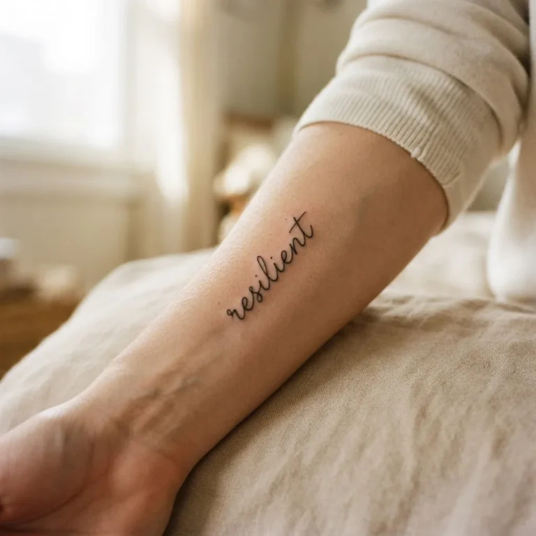
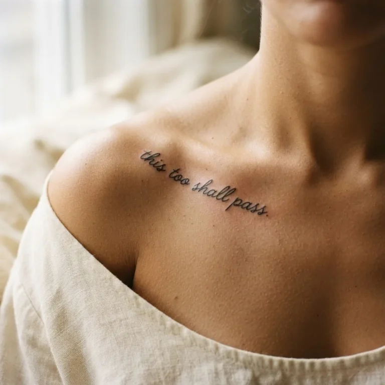
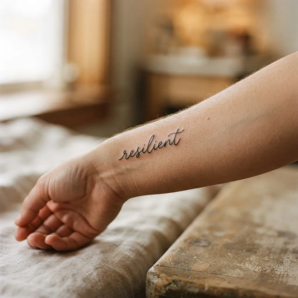
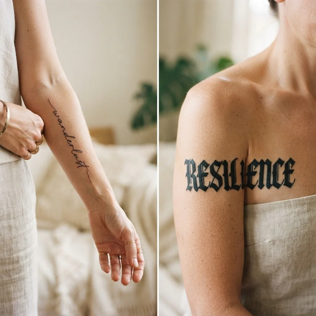
Fine-line cursive is the style dominating Pinterest boards right now, and for good reason. Delicate, looping letters with thin, consistent strokes give words an almost whispered quality. Single words look ethereal. Short phrases look like handwritten notes from someone you love.
The honest note: fine-line cursive requires the most maintenance of any script style. Because the strokes are so thin, they are the most vulnerable to subtle spreading over time. An experienced artist working at the right scale (generally nothing smaller than about 8 to 10 millimeters per letter height in a fine-line style) can create a piece that stays crisp for years, but working too small in fine-line cursive is the fastest route to a tattoo that becomes difficult to read. Talk to your artist very honestly about sizing. If they recommend going slightly larger than you imagined, trust that instinct. They are protecting you.
Best placements: inner wrist, collarbone, forearm, behind the ear for very short words.
2. Classic Copperplate Script
Copperplate is a formal penmanship style with roots in 18th-century engraving, where a pointed flexible nib created dramatic variation between thick downstrokes and hairline upstrokes. It is elegant in a way that is genuinely timeless. Think wedding invitations, old love letters, the kind of handwriting that makes you feel like something important is being said.
As a tattoo, Copperplate script has real staying power. The contrast between thick and thin strokes gives the design visual structure even as the thinner lines age. It suits meaningful phrases, names, and even single meaningful words beautifully.
Best placements: forearm, shoulder blade, sternum, upper back.
3. Spencerian Script
If Copperplate is formal elegance, Spencerian is romantic elegance. Developed in mid-19th-century America as a more fluid, expressive alternative to Copperplate, Spencerian script has oval forms, gentle shading, and sweeping loops that feel genuinely graceful. It was the style used for the original Coca-Cola logo, which gives you a sense of how deeply embedded it is in American visual culture. For a deep look at how calligraphy traditions like these evolved over centuries, Domestika’s history of calligraphy is a genuinely lovely read.
As a tattoo, Spencerian works beautifully for single meaningful words and names. The loops and sweeps give it personality without sacrificing legibility.
Best placements: collarbone, ribcage, inner arm, ankle.
4. Old English / Blackletter
Old English, also called Blackletter or Gothic script, is the heavy, angular style borrowed from medieval European manuscript calligraphy. Bold, geometric, unmistakable. This is a style with serious visual authority. It holds up extremely well over time because the strokes are thick and there is strong contrast built right into the letterforms.
Blackletter is not delicate. It makes a statement. It works for names, words with personal or cultural significance, and short phrases where you want the lettering itself to carry as much weight as the meaning. In certain cultural traditions, particularly in Chicano tattooing, Old English lettering carries deep historical and community meaning.
Best placements: chest, forearm, upper back, thigh. It tends to need a bit more room than fine-line styles, so smaller placements can feel cramped.
5. Brush Script / Casual Script
Brush script mimics the look of letters painted with a wide-tipped brush: bold at the strokes, slightly imperfect, full of movement. It feels modern and expressive without being heavy. Artists who specialize in this style can make a word look like it was written in a single confident gesture.
This is one of the most versatile styles for personal phrases and mantras. It feels a little more laid-back than Copperplate or Spencerian but still very intentional.
Best placements: forearm, thigh, shoulder, calf.
6. Typewriter / Vintage Serif
Not all script tattoos have to be cursive. Typewriter-style lettering, with its even, upright letters, serifs, and slightly mechanical feel, is having a real moment. It suits literary quotes, dates, coordinates, and anything where you want the words to feel more like a printed keepsake than flowing handwriting.
Because the letterforms are upright and generally well-spaced, typewriter-style lettering tends to age more predictably than fine-line cursive. Each letter is distinct, which means there is less risk of them bleeding together.
Best placements: ribcage, forearm, inner arm, collar area.
7. Minimalist Single-Word
Sometimes the right tattoo is just one word. Clean, simple, enough space around it to breathe. Minimalist single-word tattoos work in almost any style, but the most popular version right now is a clean, slightly thick modern cursive or a simple upright serif. The key is that the word is doing all the work, so it needs to be a word you would never get tired of reading.
Common choices include words like “breathe,” “enough,” “believe,” a loved one’s name, or a word in another language that carries personal meaning.
Best placements: wrist, collarbone, behind the ear, inside of the arm.
8. Handwriting Style / Custom Lettering
This is one of the most emotionally meaningful options in the script tattoo world. Some artists specialize in replicating someone’s actual handwriting, turning a note written by a parent, grandparent, or partner into a permanent piece. Others develop a fully custom lettering style that looks like nobody else’s handwriting, unique to you.
If you are considering a handwriting tattoo, you will need to work with an artist who specifically offers and excels at this. Bring an original example if you want to replicate someone else’s writing. The consultation matters enormously here, more than for almost any other style, because the artist needs to understand the emotional weight behind the piece.
Best placements: inner forearm, wrist, collarbone, ribcage.
9. Gothic / Ornamental Script
Gothic script takes the structure of Blackletter and adds decorative flourishes: ornate serifs, curling terminals, sometimes small illustrative elements woven into the letters. It is dramatic, dark, and genuinely beautiful in the right hands. It suits longer phrases when done by an artist who specializes in it, and individual words when you want serious visual impact.
Best placements: chest, ribs, upper arm, thigh, back.
10. Italic / Slanted Roman
Italic is the style most people mean when they say they want something “in between cursive and print.” The letters are separate but slanted, with a clean, confident energy. It is highly legible, pleasantly timeless, and works across a wide range of phrase lengths. An italic tattoo often looks more contemporary than traditional cursive while still being clearly intentional.
Best placements: forearm, calf, ribcage, shoulder.
11. Fine-Line Block Letter Hybrid
Some of the most interesting lettering tattoos happening right now blend the clean structure of block letters with the delicacy of fine-line technique. Individual letters are bold and readable but executed with extremely precise, lightweight lines. It is modern, graphic, and particularly striking on the forearm or collarbone.
Best placements: forearm, collarbone, upper arm, shin.
12. Watercolor Blended Script
Watercolor script combines flowing lettering with loose, painterly color washes behind or within the letters. The words are usually in a clean cursive or brush script, and the color creates a dreamy, artistic backdrop. This style is genuinely stunning when fresh, but it requires more touch-ups over time than solid black styles because lighter pigments and washes fade more noticeably with sun exposure.
If this style calls to you, talk honestly with your artist about longevity and aftercare, particularly about sun protection for healed pieces.
Best placements: forearm, shoulder blade, thigh, upper back where you can show it off.
13. Fine-Line Latin or Foreign Language Script
Choosing words in Latin, Italian, French, or another language you feel a connection to adds an additional layer of meaning and visual beauty. The flowing quality of Romance languages in particular translates gorgeously into cursive script. Common choices include Latin phrases (“dum spiro spero,” meaning “while I breathe, I hope”), Italian words, and Japanese or Arabic text rendered by artists with specific expertise in those scripts.
A critical note: if you are considering text in a language or script tradition that is not your own, please research deeply and respectfully, and work with an artist who has genuine expertise in that script. Translation errors and cultural missteps in permanent ink are painful in more ways than one. Always, always verify the exact meaning and accuracy of foreign text with a fluent speaker before committing.
Best placements: varies by phrase length; forearm, ribcage, and collarbone are popular.
14. Stacked / Vertical Script
Instead of running horizontally along the body, stacked or vertical text runs down the spine, the side of the ribs, or the length of the forearm. It is a placement choice as much as a font choice, but it completely transforms how a phrase reads and how it interacts with the body’s natural lines. A phrase that wraps along the spine can feel like the words are literally part of your structure.
Best placements: spine, side ribs, inner forearm running toward the wrist, back of the calf.
15. Mixed-Style / Illustrative Lettering
Some of the most beautiful script tattoos use more than one style deliberately, combining a bold word in Blackletter with a delicate fine-line phrase beneath it, or weaving script into a floral or geometric illustration. This is where lettering becomes real tattooing as an art form. It requires an artist with serious design experience, and it is worth spending real time reviewing portfolios before booking.
Best placements: larger areas, chest, thigh, forearm with room to breathe, back.
Sizing and Legibility: The Honest Conversation
Here is the thing I always wish someone had told me earlier: going a little bigger than you think you need is almost always the right call for script tattoos.
I know it can feel counterintuitive. You want something delicate and fine, not large and loud. But a script tattoo that is too small for its level of detail is not just harder to read now, it becomes genuinely difficult to read in five or ten years as the skin does what skin does. Artists consistently recommend a minimum letter height that gives enough room for the strokes to stay distinct as they settle.
Your artist will help you figure out exactly what scale works for your placement and style.
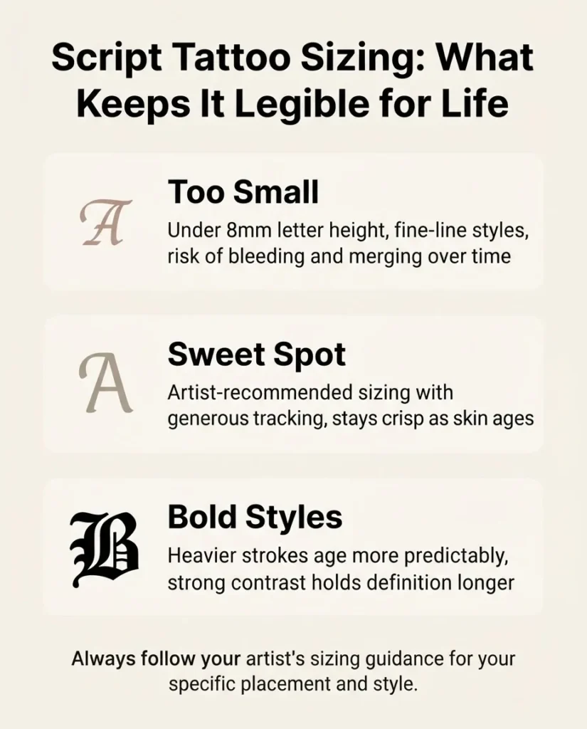
The important thing is to go into that conversation open to their guidance, not attached to a specific size you found on a Pinterest photo that might have been taken when the tattoo was one day old and on a completely different body from yours.
Placement and the Pain Reality
Placement is one of my favorite things to think through with someone who is planning a script tattoo, because the right spot does so much work. Here are the placements I see most often for script pieces, with honest notes about what to expect:
Inner wrist: One of the most popular spots for short words and phrases. Visible, personal, and suits fine-line and minimalist styles beautifully. Pain is moderate to high here because the skin is thin and close to bone.
Collarbone / clavicle: Absolutely stunning for longer horizontal phrases or single words. Suit is a range of styles. Pain ranges from moderate to high depending on exactly how close to the bone the artist works.
Outer forearm: The most versatile placement for script. Relatively low pain for most people, great visibility, plenty of length for longer phrases, and works in almost every style. This is the placement I recommend most often to people who are nervous about pain.
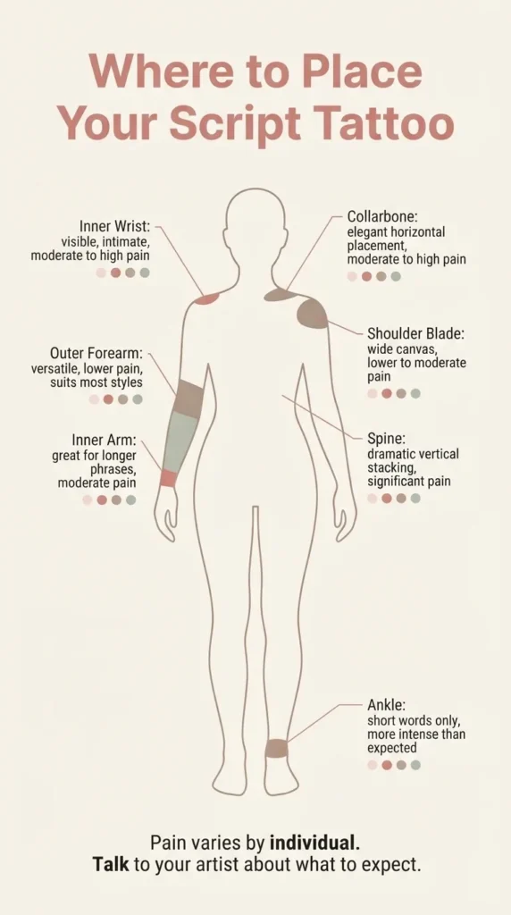
Inner forearm / bicep area: Slightly more sensitive than the outer forearm for most people, but still manageable. Good for longer or wider designs.
Ribcage and side: Deeply personal placement, often chosen for words that feel intimate. The ribcage is notoriously one of the more intense areas for pain. Healthline’s tattoo pain chart confirms this, noting that areas with less fat, more nerve endings, and skin over bone tend to hurt significantly more. That does not mean it is not worth it, many people say rib tattoos are their most meaningful pieces. It means going in informed.
Spine: Dramatic, beautiful, and genuinely works well for vertical stacked text. Pain here can be significant because of the proximity to the vertebrae.
Ankle and behind the ear: Charming for very short words or single letters. Both can be more intense than you might expect because of thin skin and proximity to bone.
How to Choose Your Words
This is the part that is harder than picking a font, and it is worth taking your time with it.
The question I always ask friends who text me before booking is: “Will this still be true in twenty years?” Not as a warning, but as a genuine filter. Some words are about a moment. Others are about a through-line. Both can make beautiful tattoos, but knowing which one you are choosing helps you decide how much weight to give the permanence.
Some of my favorite frameworks for finding the right words:
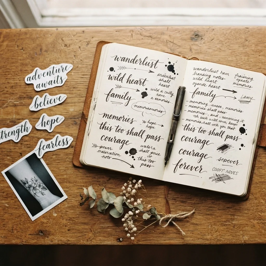
It can be a single word that functions as a personal anchor, something you return to when things get hard. “Breathe.” “Enough.” “Present.” It can be a phrase from a piece of writing, a lyric, a poem, a letter that shaped how you see the world. It can be a name that matters, a date that changed everything, or coordinates of a place that holds meaning. It can be words in a language that connects you to your heritage or to a part of yourself you want to carry forward. And it can simply be something beautiful that makes you feel something every time you read it.
Take the time. Write it down in a notebook. Live with it for a few months if you can. If it still feels right when the idea is no longer shiny and new, that is usually your answer.
How to Find the Right Artist for Your Script Tattoo
This matters so much, and it is where I see people shortcut the process in ways that lead to regret.
Not every tattoo artist is equally skilled at lettering. Illustration artists and lettering artists often have quite different strengths, and script work requires precision and an understanding of how letterforms behave at different scales. You want someone whose portfolio shows actual healed lettering photos, not just fresh tattoo photos taken right off the table, because healed results tell you the truth.
When you are searching for an artist, look specifically for script and lettering work in their portfolio. Look for even spacing, consistent line weight, and clean, legible results. Check that the studio is licensed by your local health authority. A well-run studio will have current certifications visible, follow strict hygiene protocols including single-use needles and proper sterilization, and be happy to answer questions about both.
The FDA’s tattoo safety page is worth reading before you book, particularly if this is your first tattoo, because it gives a clear picture of what ink-related risks exist and why choosing a reputable, licensed professional matters so much. The FDA notes that reactions to tattoo inks can happen right away or even years after getting inked, which is another reason why working with experienced, reputable artists using quality inks is so important.
Social media, especially Instagram, is genuinely one of the best tools for finding an artist who specializes in the style you want. Search hashtags specific to your style, follow artists whose work you love, and look at how consistently their results hold up across different clients and placements. Consistency in a portfolio is one of the most reliable signs of genuine skill.
When you find someone you want to work with, book a consultation before committing. A consultation is a conversation, not a commitment. Come with reference images, your phrase, a sense of placement, and an open mind. Ask to see healed examples of script work similar to yours. Ask how they would approach sizing for your placement. Ask about their touch-up policy. These are exactly the kinds of questions a good artist will welcome.
The Skin, the Ink, and What You Should Know About Reactions
I want to mention this briefly because it belongs in any honest guide about tattoos and because it sometimes gets glossed over in inspiration content.
Tattoo ink sits in the second layer of skin, the dermis, where it is meant to stay. For the vast majority of people, this goes smoothly. But skin reactions do occur, and knowing the signs matters. The American Academy of Dermatology notes that reactions can include prolonged redness, bumps, rashes, or intense itching, and that they can sometimes appear not right away but years after getting a tattoo. Red pigment is most commonly associated with allergic reactions, but any color can be involved.
For a more detailed clinical look, DermNet’s guide to tattoo-associated skin reactions outlines the types of reactions that can occur, from acute inflammatory responses to longer-term hypersensitivity reactions. This is not meant to scare you. The vast majority of people heal without issue. It is meant to make sure you know that if something feels wrong during healing, seeing a doctor or dermatologist is always the right call, not something to dismiss or search for home remedies for.
If you have a history of skin sensitivities, allergies, or reactions to metals or cosmetics, it is worth mentioning that to your artist before your appointment and consulting with a dermatologist if you have specific concerns.
Aftercare Basics: What to Expect During Healing
Your artist will give you specific aftercare instructions, and those instructions are the primary guide.
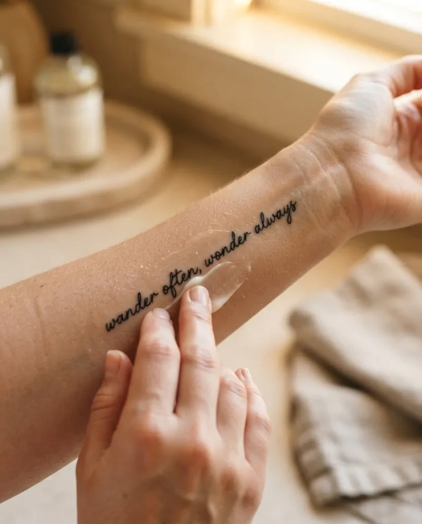
Full stop. What I can share here is a general sense of what the healing process involves, so you are not surprised.
Surface healing for most tattoos takes roughly two to four weeks. Full healing at the deeper skin layers can take several months. During the surface healing phase, most people experience some redness, peeling, and itching. The tattoo may look slightly faded or cloudy as the skin heals over it. This is normal.
The American Academy of Dermatology’s aftercare guidance recommends keeping a new tattoo clean, avoiding prolonged sun exposure, and using a water-based moisturizer rather than petroleum-based products, which can affect how ink settles. But again, follow your artist’s instructions specifically, because studios and individual artists often have their own carefully developed protocols.
For script tattoos in particular, avoiding stretching the skin over a healing piece is especially important. Choose clothing that does not rub against the placement during the first few weeks. If your tattoo is on your ribcage or an area that moves significantly with your body, talk to your artist about any specific considerations.
Once your tattoo is fully healed, consistent sun protection is one of the best things you can do for long-term crispness, especially for fine-line styles where fading shows most.
A Final Note Before You Book
If you have read this whole guide, you are already doing this right. The dreaming and researching and deciding phases are not procrastination. They are part of the process. The best script tattoos I have seen, and the ones people tell me they love most years later, came from people who took their time, got clear on what they wanted, found an artist who genuinely specializes in the style, and walked into the studio feeling ready.
You do not have to be certain about every single detail before booking a consultation. But you should feel clear enough about the general direction that you can start a real conversation with an artist. That conversation, that back-and-forth about words and styles and sizing and placement, is often where the best ideas come from.
Take the time. Do the research. Find the right person to do this with you. And then trust both your instincts and theirs.
That is how a good script tattoo starts.
Always work with a licensed professional tattoo artist. Tattooing is a professional practice and is legally restricted to adults (18 and older in most US states, though age minimums and regulations vary by location). If you experience any concerning skin reaction during or after healing, please consult a doctor or dermatologist.